2024 ・ B2B SaaS ・ Product Design ・ Design Systems ・ Figma
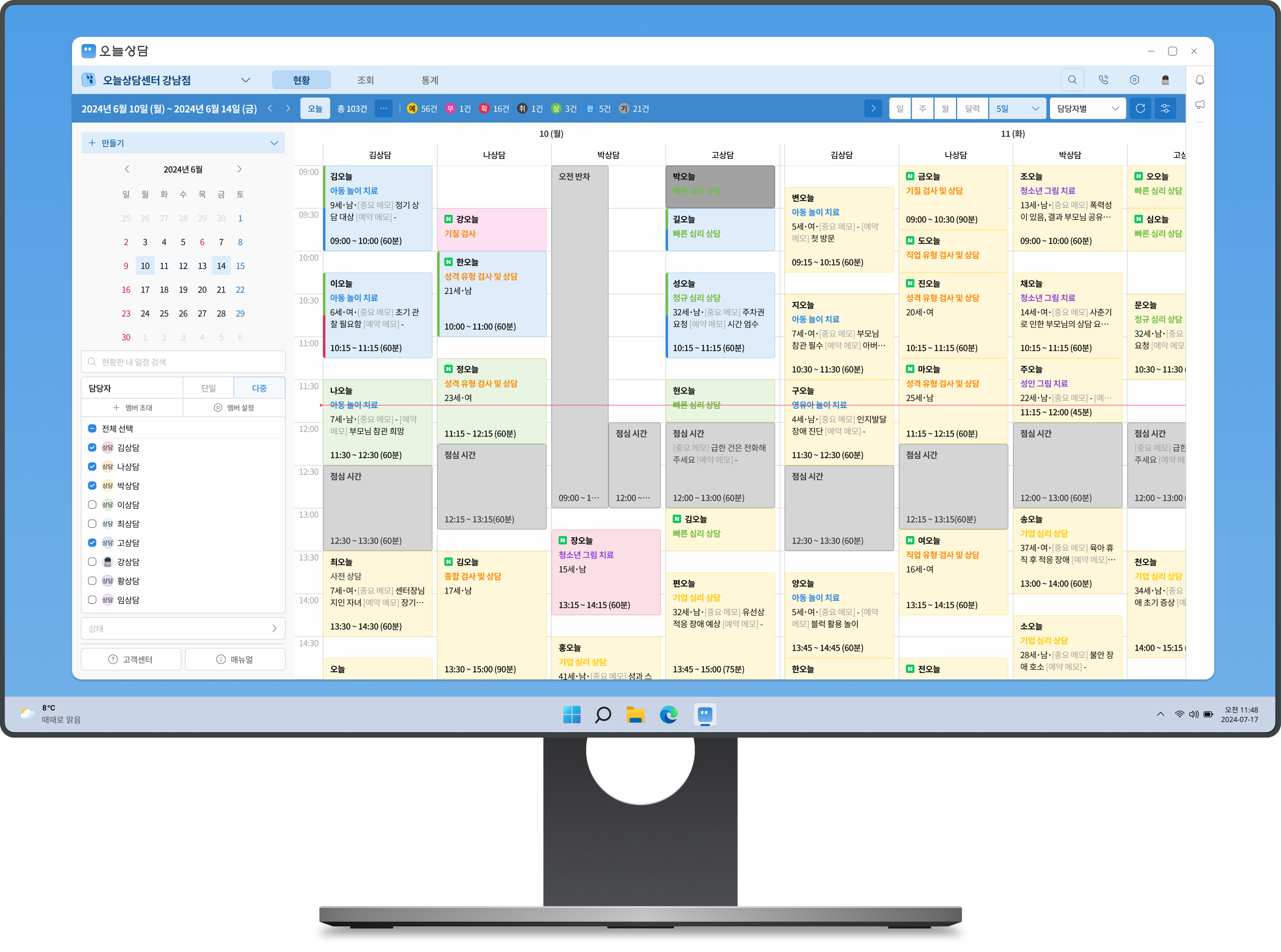
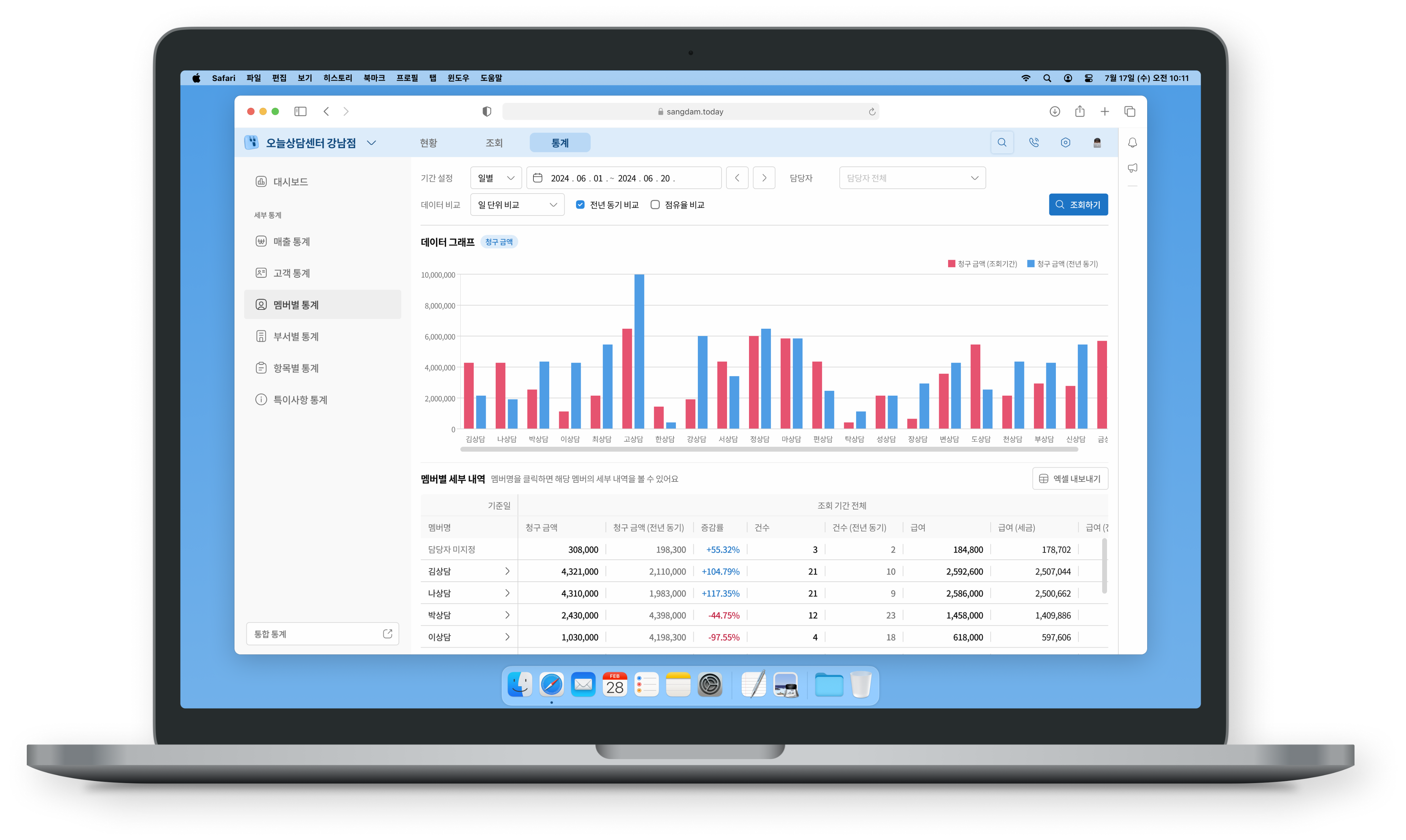
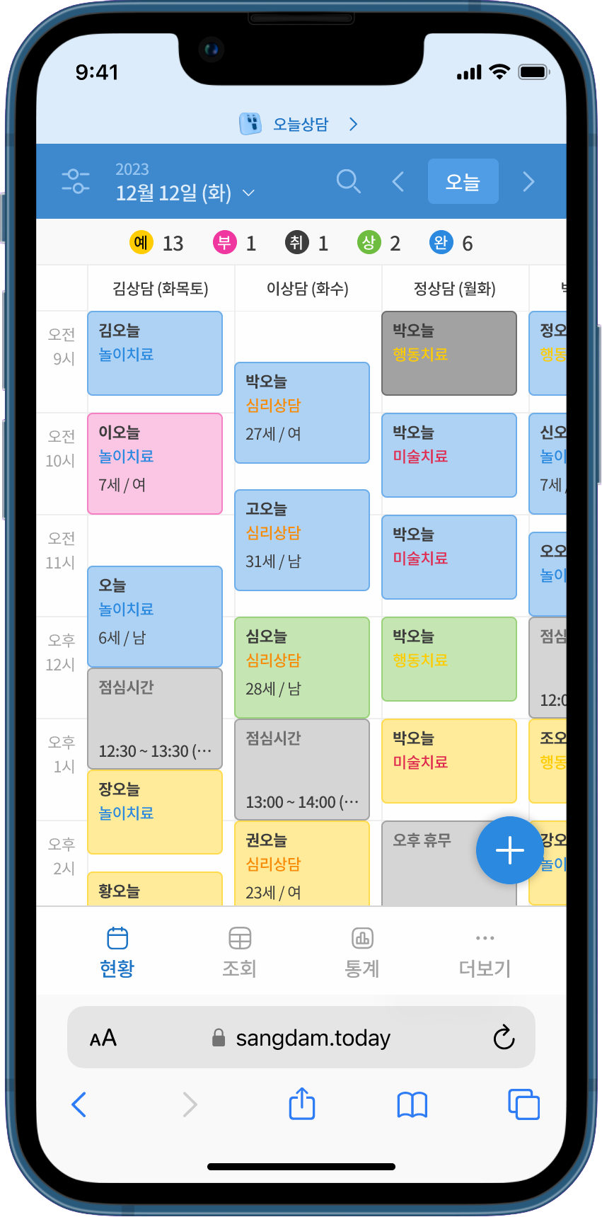
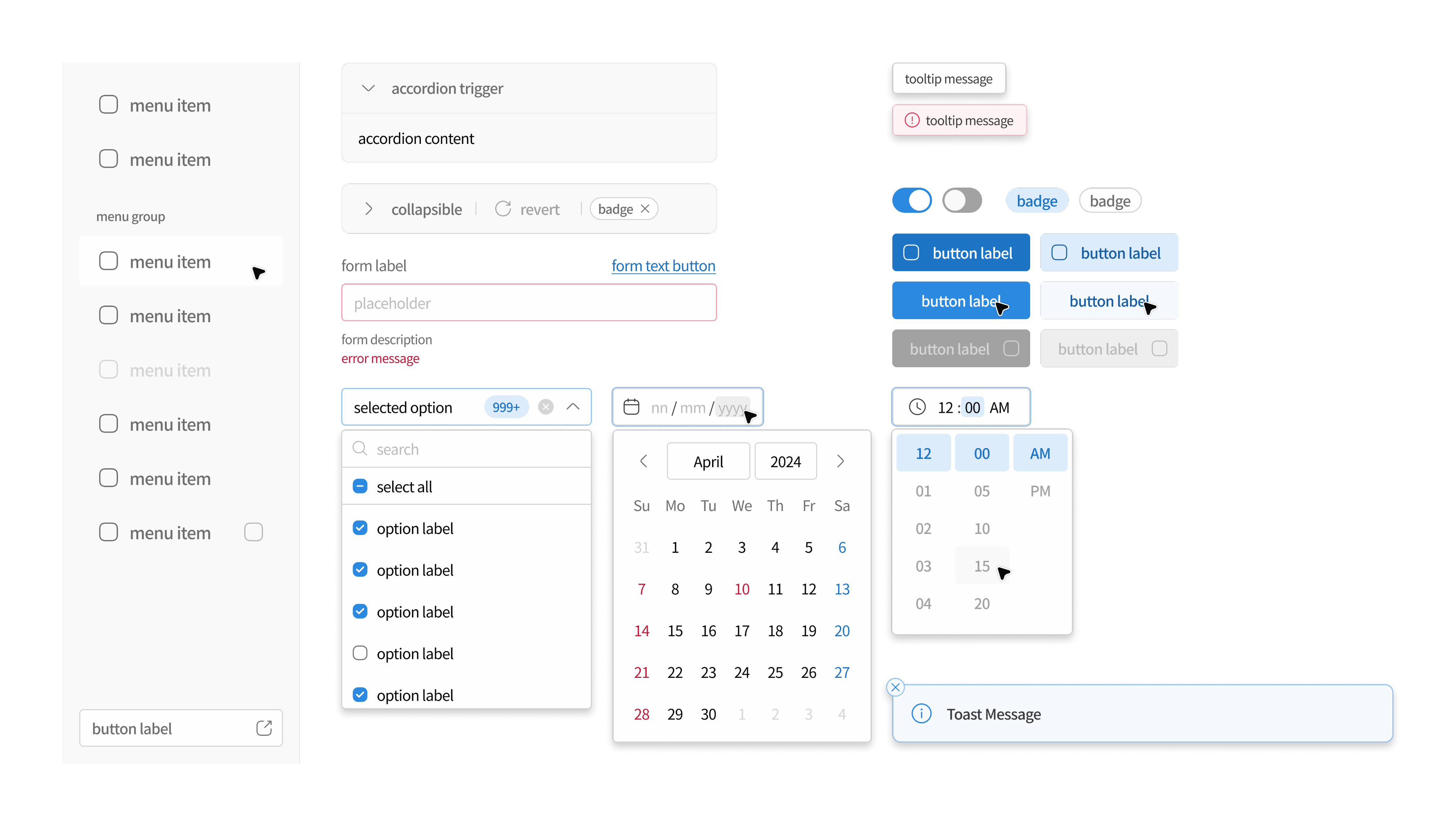
Sangdam Today Design System 2.0
Scaling B2B SaaS through Design-to-Code Alignment
Timeline
Apr 2024 – Mar 2025, 12 months
Role
Lead Designer, Design System Architect
Team
1 PO, 2 Front-end Engineers
Skills
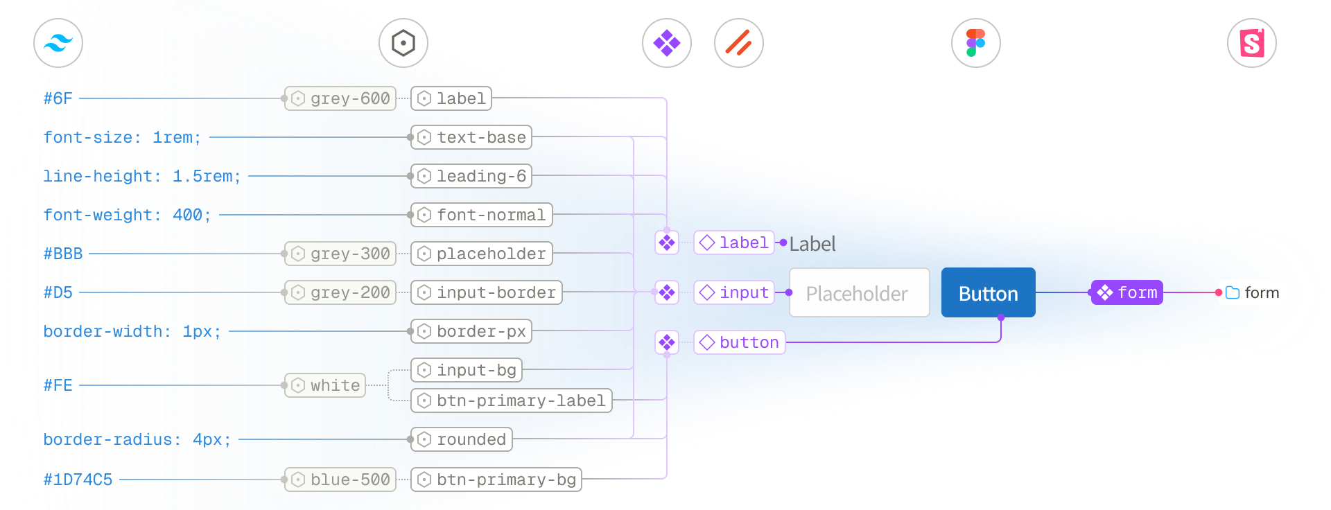
Atomic Design, Figma, Storybook, Svelte, TailwindCSS, Shadcn-Svelte (UI)